Tuesday, April 12, 2011

I made the experimental book, the beehive out of rope... gluing it together with a hot glue gun


I made it almost twice the size of the prototype version becuase I wanted to make sure the honey comb pieces would fit inside,.


I spraypainted the hive orange with a small amount of gold spray paint over it.
I also added a key hole, for the "secretive" aspect.


Inside are the sections... the honey comb pieces and the honey pouch.

These are the sections with the honey comb pattern sprayed on in orange and quotes from the novel.

Thursday, April 7, 2011

Experimental book cover


The above image is of the sections inside a man made beehive.
Most of them are empty for the bees to make honey in but there are always one or two filled with honey for the bees to eat.


For my handmade book cover I want to make a beehive with a keyhole in the front so that it's a secret hive!
 I'll make the hive out of rope and spray paint it an orangey colour. I want to have honey flavoured paper inside the hive. I want the paper to be in the shape of honeycomb pieces.  I'm also thinking of having a book mark made form ribbon with a key on the end.
 Above are some photos that I took of a man-made beehive. In each hive there are sections (see the image directly above) in which the bees either work to make honey or where the honey is kept as food for the bees.
 In my handmade book I want to have several sections like this and then one or two actully filled with honey.
The rest of the sections will have a honey comb shaped pattern on them (as above) and also words or quotes from the novel.
I really like how the yellow fades across the book cover. I think it looks better with the pale yellow on the front because the darker yellow might make the the cover look too crowded.
Also the yellow colour combined with the black and grey colours of the gun make the book stand out and give an impression of the bee.


I like how this pale yellow looks subtle and doesn't overpower the image but at the same time  I don't think this shade portrays the overall mood of the novel. To me, this pale yellow cover sugests innosence and doesn't reflect the darker tone of the book.

I think this browny shade does reflect the kind of murky dark mood of the book but I don't really like the colour so I don't think I'll go with it for the final cover.
I like how subtle this cover looks but also I don't want the gun to blend into the background.
I like how this greyish colour compliments the colours in the gun but I think with the blue background above the bee bullet stands out more.


I just like how this green shade fades to grey on the front. I think it works well with the lettering on the front. Also it makes me think of nature and I think this works well because a lot of the book it set outdoors.

I think the purple shade here really reflects the dark mood of the book.
I think it also looks nice with the gun. I'll see how this one looks when printed ...with no spelling mistakes this time!

Monday, April 4, 2011

Book cover design project.

This cover is the same design as below only this is made up of tiny hexagons which look like honeycomb pieces. I prefer this design to the one below but the authors name is difficult to read.

The idea behind this cover was that the bee is slightly hidden behind the honeycomb pieces. I did this because I usually associate secrets with hiding and mystery.
This cover design is of a beehive with a keyhole.. a secret hive!?
I liked the idea but thought that it was a little boring so I experimented with different colours on photoshop.
This cover is of a similar concept to the first. I think the idea of the shadows of the bees suggest secrecy. However I thought the pale yellow colour didn't accurately reflect the overall tone of the book. The mood of story is much more sinister and dark than this cover might suggest.

Visual Communication.

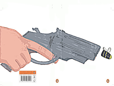
This is my origional illustration of the gun before Ichanged it on photoshop.
I liked the idea of a "bee bullet" being shot from the gun as both the bee and the gun are two strong reoccuring images throughout the novel, I thought it would be a good idea to link them together in this way.

I really liked how the colouring of the gun turned out in this image, however I felt that the back of the book was too bland so I  decided to draw the gun overlapping onto the back.
I think the book looks far more interesting with the image of the gun covering the side and back as well as the front. Also I like how the blue colouring of the background fades to white on the front cover.